Finding the right font for your website, social media graphics, email campaigns, and other digital assets can be tricky. Fonts are powerful. They can help you connect with your audience or turn them off. Fonts have psychological underpinnings and have been shown to significantly affect the look and feel of a brand. After all, you get a different vibe from reading “this Impact font” than “this one in Terminal.” So choose your fonts wisely, since they work on a number of different levels and are often more than meets the eye.
- How Do I Find the Right Typeface?
- How Do I Optimize the User Experience With Fonts?
- Which Fonts Work Best for Digital Media?
- Key Considerations for Choosing Digital Fonts
- Use the Power of the Font
How Do I Find the Right Typeface?
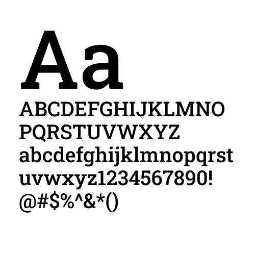
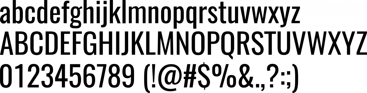
The beautiful thing about font choices is that there are more fonts than ever from which to build your brand. The difficult thing is that only a few will be the best fit. As we explained in the Best Fonts for Print blog, there is a difference between fonts and typefaces, though the two terms are often used synonymously. A typeface is a complete set of characters with a common design aesthetic, i.e., serif, san serif, and script, while a font is the variation in weight and size of a typeface.
RELATED: 11 Graphic Design Terms You Need to Know
This article is designed to help you find the best fonts for digital use, including websites, social media, blogs, and wherever else your content appears on a screen.
How Do I Optimize the User Experience With Fonts?
The most important thing to keep in mind when selecting the best font for websites or the best font for apps is how the user experiences it. There are two factors that affect the user experience: legibility and readability.
Based on J. Ben Lieberman’s seminal book, Types of Typefaces, published in 1968, these terms are distinct: legibility is a measure of how easy it is to distinguish one letter from another in a particular typeface, including sufficient contrast from the background. Readability, however, means what you think it means: the ability to read the text.
The easier it is for users to read the text on your website or digital assets, the more likely they are to engage. To increase readability, choose fonts that are designed for use in specific parts of content (i.e. big, bold fonts in headers and clean, simple fonts in the body). This is especially important when designing for accessibility.
RELATED: How to Design for Accessibility: 13 Tips & Tricks to Use
Which Fonts Work Best for Digital Media?
Choosing the right fonts for digital media is crucial for ensuring readability, aesthetic appeal, and overall user experience. There are thousands of fonts out there, and here are some of the best fonts widely recommended for digital media:
- Sans-Serif Fonts
Sans-serif fonts are popular for digital media because of their clean, modern appearance and readability on screens.
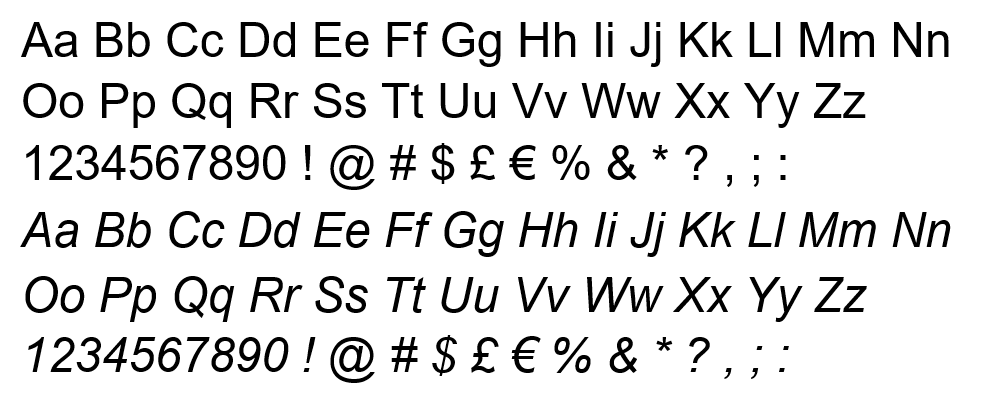
- Arial: A classic sans-serif font, it’s easy to read on screens of all sizes and it’s web safe, meaning it comes pre-installed on the majority of computers and devices, regardless of operating system.
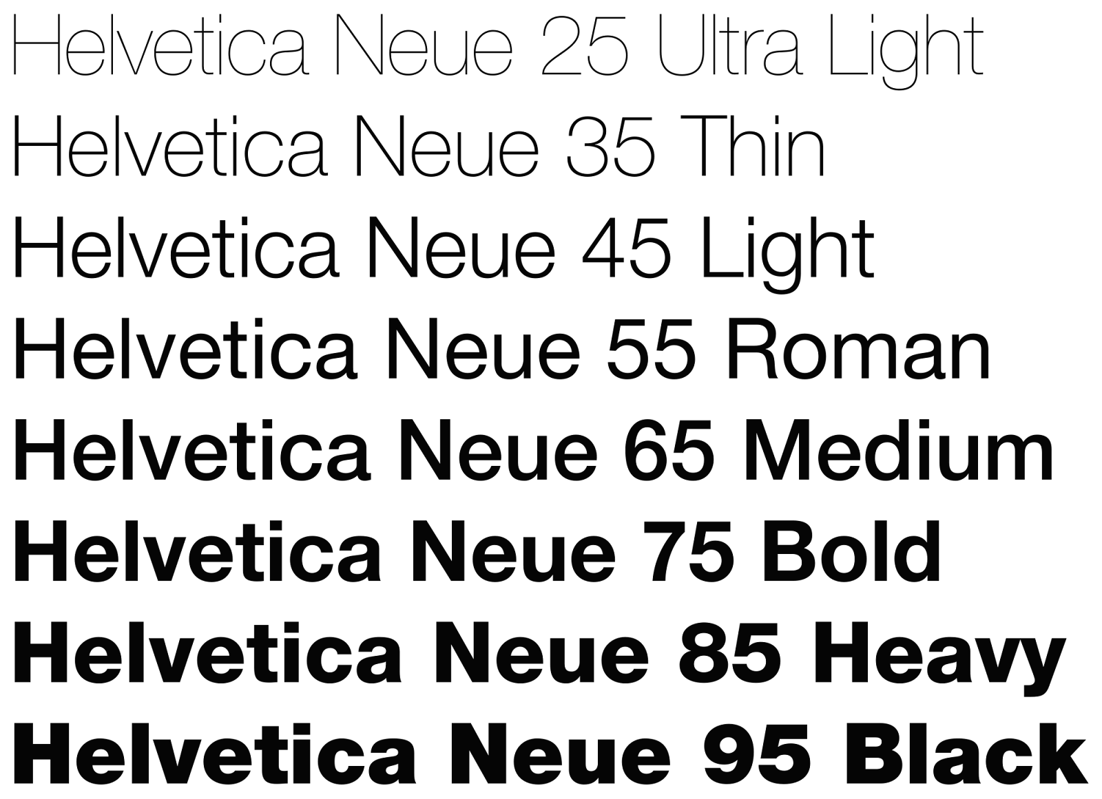
- Helvetica and Helvetica Neue: Known for its versatility and clarity, it’s often used in web design and user interfaces. Studies show that many users “skim-read”, or use a Z pattern when reading in which they sample the first line and then word-spot through the rest of the text. To help your skim-reading users easily navigate through your content, use Helvetica Neue. It’s simple, easy to read, and works well in header and body text.
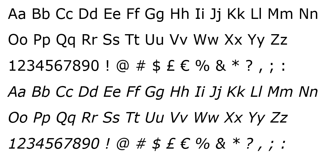
- Verdana: Specifically designed for readability on screens, it features wider characters and more space between letters.
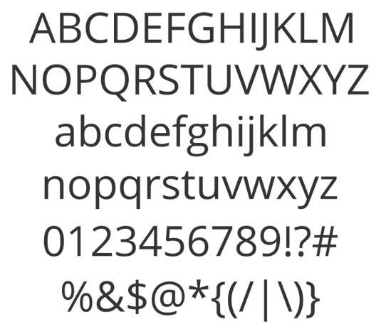
- Open Sans: A sans-serif typeface with open forms and a neutral, friendly vibe, it’s widely used for web and mobile applications (apps, blogs, social media, mobile, etc.). According to Google, Open Sans is featured in more than 90,000,000 websites. This is largely due to it being optimized for print, web, and mobile interfaces; it has excellent legibility characteristics in its letterforms.
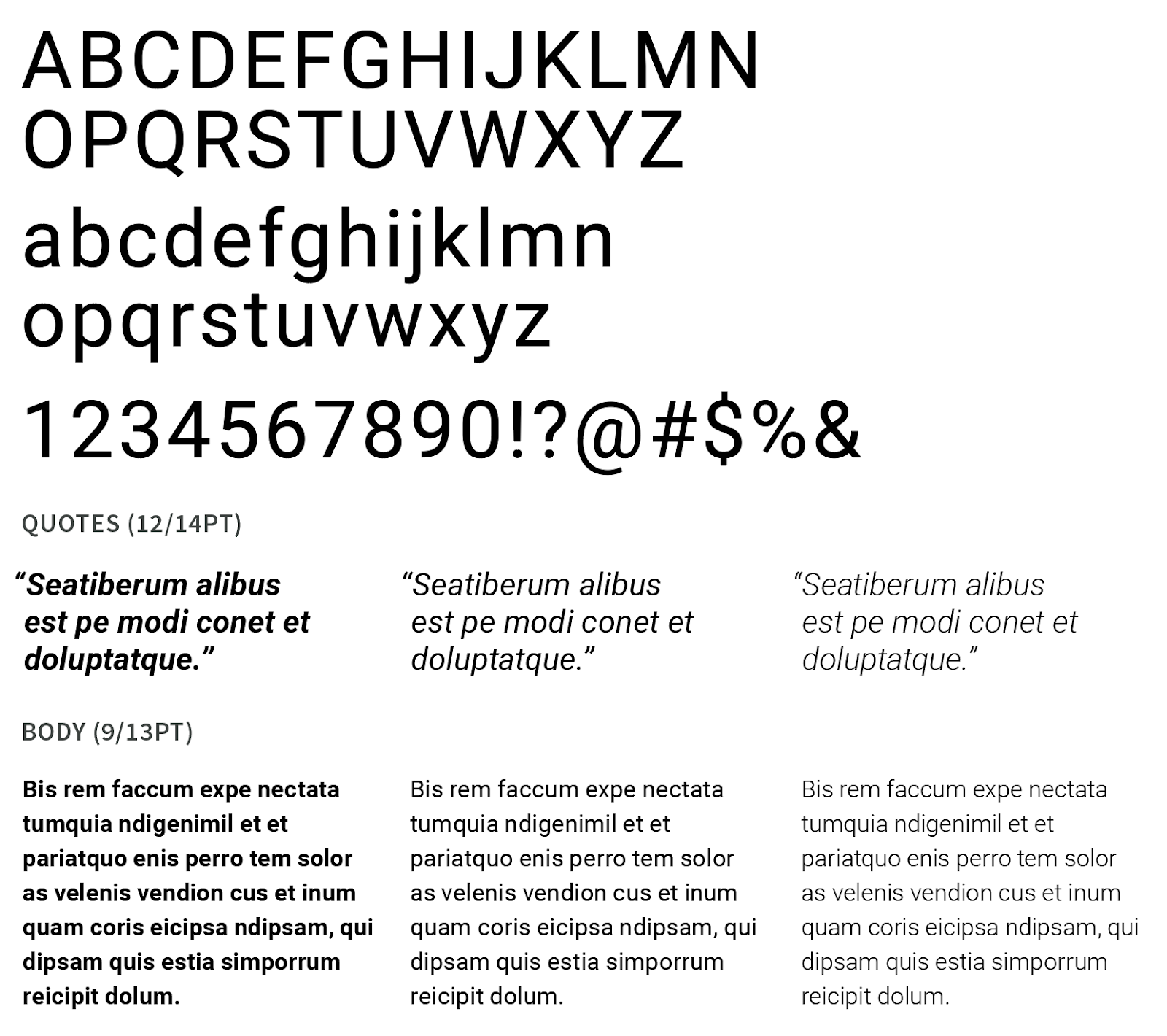
- Roboto: Developed by Google for Android, this font is highly readable and modern, with geometric forms and open curves, making it a popular choice for websites and apps.
- Serif Fonts
Serif fonts can add a touch of elegance and professionalism, though they are generally less common in digital media due to potential readability issues on screens.
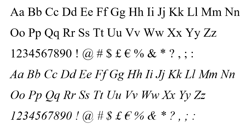
- Times New Roman: A traditional serif font often used in more formal digital documents and publications. With thin, sharp serifs, it was well-designed for newspaper printing.
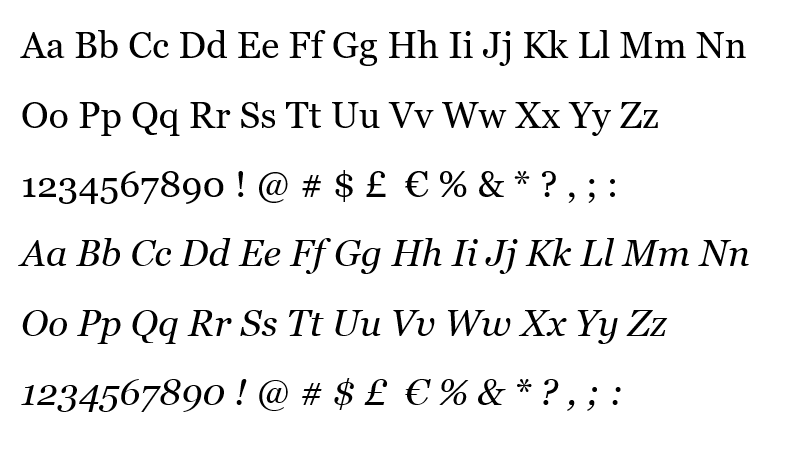
- Georgia: Engineered for clarity on screens, it's a transitional serif font that's highly readable even at smaller sizes. It’s similar to Times New Roman, but is generally larger with a larger lower-case height (also called x-height).
- Merriweather: A serif font optimized for screens with a large x-height and slightly condensed letters, it offers excellent readability and a pleasant aesthetic. It’s recommended for shorter formats because it can cause eye strain for a reader. It is most commonly used for reading passages, poetry, and personal quotes.
- Slab-Serif Fonts
Slab serif fonts are known for their thicker serifs and can add a bold, modern feel to digital media.
- Roboto Slab: This variation on Roboto combines the readability of Roboto with a more pronounced serif style.
- Arvo: A geometric slab-serif font that's bold with sharp edges and a slightly old-fashioned feel, it’s great for both headings and body text in digital media.

- Display Fonts
These are typically used for headlines and short bursts of text due to their unique and decorative styles.
- Oswald: A reworking of the classic gothic typeface style made to better fit the pixel grid of typical digital screens, it’s highly readable and suitable for headlines.
- Playfair Display: A serif font with high contrast, it works well for headlines and larger text.

Key Considerations for Choosing Digital Fonts
Now that you know some of the recommended fonts for digital media, make sure you keep the following rules in mind:
- Readability: Ensure the font is easily readable on various screen sizes and resolutions. Although they are sometimes tempting to include, avoid overly ornate fonts for body text.
- Versatility: Choose fonts that work well across different devices and browsers.
- Loading Speed: Some fonts can slow down website load times. Consider using web-safe fonts or optimizing font delivery.
- Accessibility: Ensure the font supports good contrast and is legible for users with visual impairments. One important consideration is using color combinations that are contrasting, such as avoiding yellow fonts on a white background.
- Consistency: Use a consistent font palette across your digital media to create a cohesive look and feel.
Related: Best Fonts for Print
Use the Power of the Font
The best fonts for digital media blend readability with aesthetic appeal — and most importantly connect with your audience. Sans-serif fonts like Arial, Helvetica, and Roboto are widely used for their clarity and modern look, while serif fonts like Georgia and Merriweather can add a touch of elegance. Slab serif fonts like Roboto Slab and Arvo are excellent for a bold, modern appearance, and display fonts like Oswald and Playfair Display can make your headlines stand out.
Want to know which font works best for your brand? Our design team is highly experienced at finding the fonts that capture a client’s essence and resonate with the right audiences. Never underestimate the power of a font. Let us show you what they can do for your brand!
