A good book pulls you in with a strong opening. A good flyer captures the attention with strong imagery. But, the words on the piece themselves are telling you a story at the same time. Based on the font that the creator has chosen, the text is imbued with meaning even deeper than what it conveys.
Font vs Typeface
Often, the two words font and typeface are used interchangeably, but technically, they have different meanings: typeface is a complete set of characters with a common design aesthetic. ie, serif, san serif, script, etc. while a font is the variation in weight and size of a typeface.
A font family is an extension of a font. It is a group of fonts with the same typeface that have different weights and sizes, so they are often the bold, italic, and bold italic versions of the original.
The Importance of the Right Font
If you’re publishing a book or magazine or print marketing materials like brochures, ads, mailers, and promo products, make sure to choose your font carefully, as the type you pick can make a big difference in the way that readers receive the messaging.
Related: Why You Should Ask Your Printer About Their Creative Team.
How Font Affects Readers
When selecting a font, there are two important factors you’ll want to consider. Both affect how a reader perceives your print piece:
- Readability: It doesn’t matter how beautiful your font looks. If it’s not readable, it’s not usable, period. Most books or informational items we read as adults are strictly composed of words. Why make your reader struggle to read them? They’ll likely just put it down or pass it by, rather than try to fight through it. So first and foremost, make sure that you find a font that’s easy to read.
This means that the font is legible, or that it’s easy to distinguish between separate letters. There are several ways to create easy legibility:
- Letter Spacing: You’ll want to pay attention to the spacing between letters so that they’re not too tight or too spaced out.
- Letter Size: Using the points sizing scale, make sure you’re picking a font size between 10-12 points, letting your comfort be your guide. For printed items, the font size is usually smaller to help with printing costs. Each font shows up differently in the point sizes, so you’ll need to compare them for best legibility.
- Letter Weight: This refers to the thickness of the letters, as well as styles like bold and italics. Use these styles sparingly for maximum impact.
- Serif Fonts: These are the fonts with small lines or strokes at the ends of letters, and they increase legibility by helping the reader move from one letter to the next. These strokes also help the eye group the letters together so that the brain can more easily process longer chains of text. Times New Roman is one of the more popular serif fonts, as opposed to sans serif fonts like Calibri, which do not include these extra strokes. Since sans-serif fonts can cause the eye to tire more quickly, it’s best to use these types of fonts in titles and subheads, rather than as a large body of text.
- Line spacing: Line spacing, or “leading”, is the amount of space between the baselines of each line of text. Correct leading is important because it gives multiple lines of text optimum legibility. There are no hard and fast rules, but generally too tight or too loose with impede ease of legibility.
- Feel: Another important consideration in font selection is the emotion that the font evokes. It’s incredible how a font can convey the entire feel of the piece in each swoop and curve. Many people experience this emotional connection on the gut level since it’s subconscious. If the font is off, they won’t enjoy reading it as much and may not receive your message. So it’s critical to get the font right.
How to Get Font Right
Fortunately, there are a number of ways to ensure that you pick the right font for printing your book, magazine, brochure, signage or other print piece:
- By Section: You can choose to keep the same font throughout every section of a piece, but if you’re mixing fonts, it’s important to match the font to the sections.
- Body: Since your reader will be spending most of their time navigating the font in the body of text, it’s important that it’s easy to read AND conveys the right feeling. What is the easiest font to read, you ask? Many book designers like these fonts for those reasons:
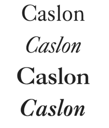
- Caslon: This checks off all the boxes for book fonts. It’s easy to read, it’s serif, and it has a warm, familiar feel that works for most books, including historical novels, romances, nonfiction, fiction, and more. This font traces its roots to 1722, when William Caslon, an English type engraver, first created it. Both the British Empire and early American colonies embraced it; In fact, Caslon was used for the Declaration of Independence. It remains one of the most popular fonts today, and has expanded through variations in its font family.
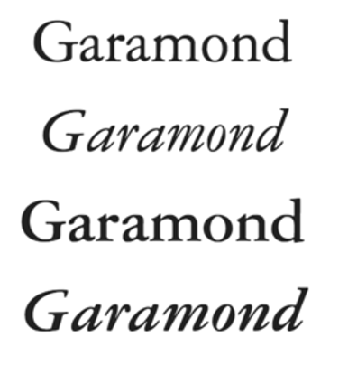
- Garamond: Similar to Caslon, this font also has a warm feel and an easy readability. It is serif as well. Conceived in 16th century Paris by engraver Claude Garamond, it is a classic pick for many types of mailers, brochures, handbooks, and more.
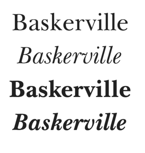
- Baskerville: Dating to the 1750s, this serif has stood the test of time and is great for a variety of print jobs due to its excellent readability. The thick and thin stroke combination made it innovative in its early days, a result of John Baskerville’s talents with calligraphy.
- Headings of a Book: Headings are short, so you can have a little fun with fonts here—the serif rule does not apply. Many times you can find a sans serif version of your body font and use that here for a cohesive professional look that also helps the headings pop and lends some variety to your print piece. This space gives you a chance to test your limits a bit and find a font that matches the feel. Some fonts seem childish or overused, like Papyrus and Comic Sans. Some cursive fonts like Harrington may be too flowery. Keep it clean and sans-serif. This applies to all titles and headings. Any sidebars also stand out when a font different from the body font is used.
- By Size and Height: You want to choose a size that’s comfortable for your audience, usually between a 10-12 point font. It’s a balance because larger font sizes tend to equate to more expensive print jobs, so you’ll need to find the right mix.
- By Digital Versus Print: Certain media are more conducive to certain fonts. For instance, the font called Interface would not work well in a printed book but is a fine choice for online reading and even magazines. You’ll recognize Courier as a typewriter font that is great for newspapers, but difficult for a novel. Choose your font based on your media too.
Related: What Kind of Book Binding Method is Right for Your Print Job?
So what’s font got to do with it? Everything, it turns out. Stay tuned as we explore fonts that work really well in digital media too, from websites to logos. Want to test a font before you buy? Sites like MyFonts let you take fonts for a test drive so you can see how they work with your piece, and you can compare fonts that sometimes have almost indiscernible differences. If you aren’t sure which font is the best one to choose for your print job, lean on our 60+ years of print experience and digital print services. We are font fanatics, and we’d be happy to help you find the one or ones that bring your piece to life.