It’s just one button, but it can strike fear into the hearts of marketers everywhere—the send button. Whether you’re sending a digital print file to commercial printers for a small batch of brochures, a large-run direct mail piece, or a large-format sign that’s the showstopper at your future trade show booths, hitting send can be the hardest part of the process.
We want you to have all the information you need for a perfect print-ready file so you feel confident when you push that button. Here, we’ll lay out what commercial printers need from you to ensure your piece is printed exactly as you picture it—and the best practices you can adopt to make the process seamless.
Related: How to Get Files Ready for Professional Printing.
First, Know the Terms
To make sure we’re on the same page (ahem, it is print after all), here’s a quick primer on some of the terms in this print-ready checklist to know when you work with commercial printers:
- PDF: Portable Document File, the gold standard for secure, dependable transfer of electronic documents. This file locks in the images, graphics, fonts, and layout of whatever software was used to create it, so it can be shared, viewed, and printed by any user through Adobe Reader, a free software that is easy to use.
- High Resolution: Generally you’ll want to use images that are 300 DPI (dots per inch) and above. If you’re printing a billboard, truck, or another larger format, you can go as low as 100 DPI. Do not print website imagery, which is often 72 DPI and will appear fuzzy or pixelated. Talk with your printer if you’re unsure of the best resolution for your particular print project.
- High-Resolution Raster Image Files: Also known as a bitmap, these include the popular GIF, JPG, TIFF, PSD, and BMP formats. Bits of information become pixels on the screen, and these create the color you’ll see. This image format is especially adept at capturing the nuanced colors of a photo or shaded drawing. However, use caution. When a raster image is blown up to larger sizes, you may see the pixelated dots. For this reason, raster files are generally suitable for smaller-sized projects.
- High-Resolution Vector Image Files: Constructed with mathematically formulated lines, vector image files can be enlarged without causing the image to become blurry. Known as the AI, SVG, CDR, and EPS file formats, vector image files are used most for line art, typography, and illustrations. Note that both raster and vector files can be rendered in EPS or PDF.
- RGB Vs. CMYK: Printers and scanners produce images in three colors (red, green, blue), known as RGB. These will need to be converted through Adobe Photoshop to CMYK (cyan, magenta, yellow, and black) before they can be printed. Known as a four-color process or full-color printing, CMYK colors combine to create every color imaginable.
Pro Tip: Do not trust the color on your screen. Get a color proof if you want to know exactly how a color will print.
Related: You’ve Got a Print-Ready File? Now What?
Ready to Get Print-Ready?
Follow these steps for perfectly printed pieces:
Spell Check It
It can be tedious, but it’s critical to make sure you’ve spell-checked the piece. Do this several times! Similarly, if your industry requires you to follow advertising law and regulations, such as fair housing compliance, make sure your print file is in full compliance, and approved by a certified expert, before sending it to print.Furnish Fonts
To ensure your fonts are correct, please include font styles if you’re sending any non-PDF files. For a PDF - outline or flatten the font file to lock it in.Size It Right
This is a simple one. Make sure your file is sized to match the finished product. A 4 x 6” postcard needs to be set up that way.
Pick Your Print File Format
Different file formats compress information differently. Pay attention to the overall file type. Even though it’s tempting to choose one that opens quickly, it’s most important to use a format that gives you the highest-quality images. TIFF and PNG are two such formats. Both have less compression and a higher quality. We recommend avoiding JPGs if possible because they are recompressed every time someone saves them, possibly decreasing their quality.
Vector or Raster?
For line art, logos, and text, a vector is a clear choice, as it can be scaled up or down while maintaining its quality and integrity. For a photo, however, you can look at raster files, as long as scaling up doesn’t blur the image. Consider how large your finished image will be—and you can reach out to us if you’re unsure which will work best for your particular print project.Choose the Resolution
Excellent resolution is non-negotiable. If you want to make an impact with print, you want something people can see clearly. Therefore you must pick high-resolution imagery at 300 DPI or above. A bitmap image requires at least 600 DPI.
Pro Tip: Choose your resolution early in the process. If you try to change the image by resizing it, you may not be able to achieve a higher resolution later.
Select the Right Color Format
This is an important consideration because commercial printers often encounter PDFs with incorrect color formats. Since marketers are used to working with RGB on their screens, they need to take the extra step to get images print-ready by formatting them in CMYK.Here’s how:
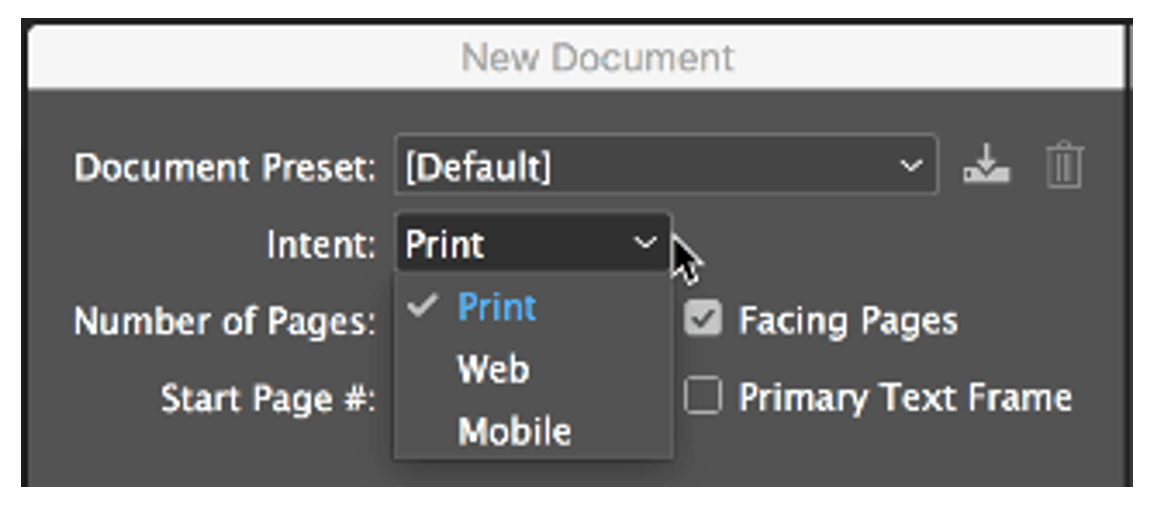
In Adobe, go to New Document, and pull down the Intent menu to select “Print.”
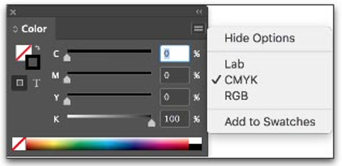
Or go to the Color Panel and pick the color space there:
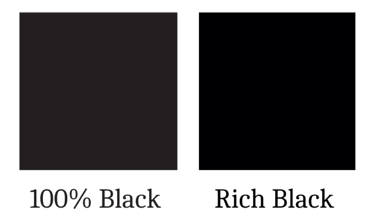
Pro Tip: Keep the same shade of black throughout your design. It’s hard to tell the difference between rich black and 100% black on a screen, but in print it’s obvious. Rich black is just that—rich and deep. The 100% black is greyer and duller. Whichever you pick, stay consistent!
Related: How to Set Up Your Print-Ready PDFs in Adobe.
Time to Fold
Many direct mail pieces, posters, billboards, and other signs don’t require folding, so you can skip it if that’s the case. However, you’ll need to build folding instructions into your print file with specific fold marks for cards, packaging, brochures, or other pieces that require folding. First, think through how you’d like the finished piece to look. Then use the guides and ruler in InDesign to mark lines for the folds. Remember the thickness of the paper affects exactly where the folds are.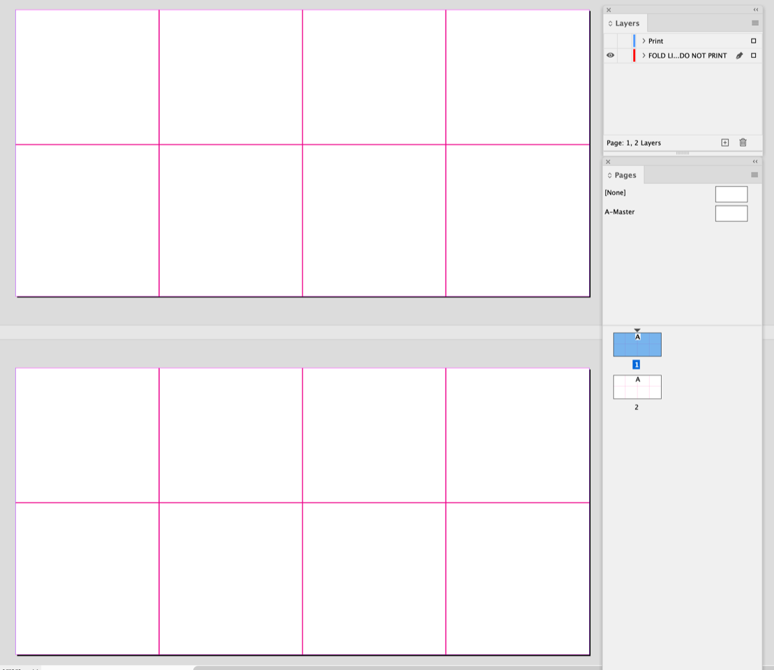
Set Margins and Bleeds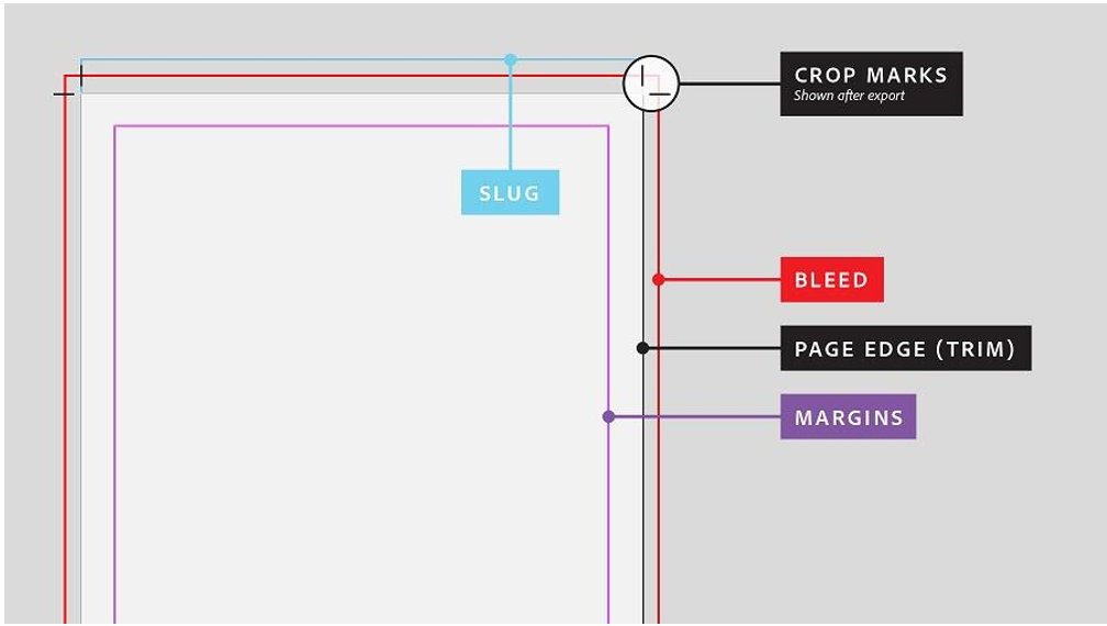
A margin, or “safe zone” defines the border between the printed area and the page edge. It needs to be a minimum of 1/16” or 0.0625.” A good standard is a little larger, at 0.125” so your printed image doesn’t get cut off. In InDesign, go to Layout > Margins and Columns to set your margins.
If the printed area has bleed, the image will extend to the exact edge of the printed page. Printers are not generally good at this, so setting a bleed does the trick. Just set the margins outside of the size you’d like to print and mark these as the bleed. The press prints ink out to this area, and the page will be cut down to the desired size, eliminating any white borders around the edge. The slug line marks the space that is still printed but will be cut off with the excess bleed.
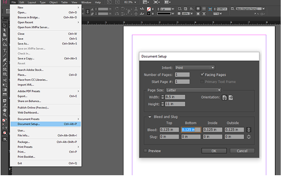
To set up a bleed in InDesign, go to File > Document Setup and update the bleed in this dialogue box.
A typical bleed is 1/8” (0.125”) on all sides, or 0.25” larger than the trim size (where the cut is made). If your project does not have a bleed, the commonly used measurement is a 0.5” – 1” margin between the edge and your design.
Get the Name Straight
You’re almost there. It’s time to save your print file with a name that will help you and the printer keep it organized. Consider a logical naming convention like some of these examples:
- Client name, initials, or last name (Smith)
- Client’s brand (SmithShorts)
- Client’s campaign (JuneSale)
- Channel (Flyer)
- Element needed for the channel (Image)
- Date (2024_01_25)
- Version number (v01)
So a file might be named something like:
“Smith_SmithShorts_JuneSale_Flyer_Image_2024_01_25_v01” or a variation of this. While it seems a bit arduous in the beginning, it will save time in the long run!
Related: Print Like a Pro Today!
Proof It
Don’t forget to request a proof. Even if it’s digital (remember the color won’t be true), this will help ensure you didn’t miss anything. It never hurts to read, read, and read again at the proof stage. Typos are everywhere, and sometimes we miss them the first two times.
Time to Hit Send!
If you’ve followed this list, you’ve checked all the boxes and you can hit send with confidence, knowing you’ve furnished your commercial print partner with all the instructions they require to print the piece as you envision it. If you’re ready to hit send, here are your best options for a secure and successful transfer to your print partner. Have a question? We’re here to help. It’s time to send it and feel great about it.